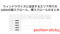
レスポンシブでtableを書いて、スマホで見ると、どうしても横幅が足りなく、tableが不細工な形になってしまう。
最近では、最左列を固定して横スクロールさせるUIも増えてきた。
また、ブラウザベースのシステムを構築する時など、tableで一覧表を表示させるが、スクロールするとタイトル行もスクロールして見えなくなったり、横スクロールすると、いったいどの行を見ているのはわからなくなってしまう。
理想を言えば、EXCELの「ウィンドウ固定」のように、タイトル行と列を指定して、残りを自由にスクロールさせたい。もっと言えば、ブラウザのウィンドウサイズを変えても、そのサイズに追従させたい。
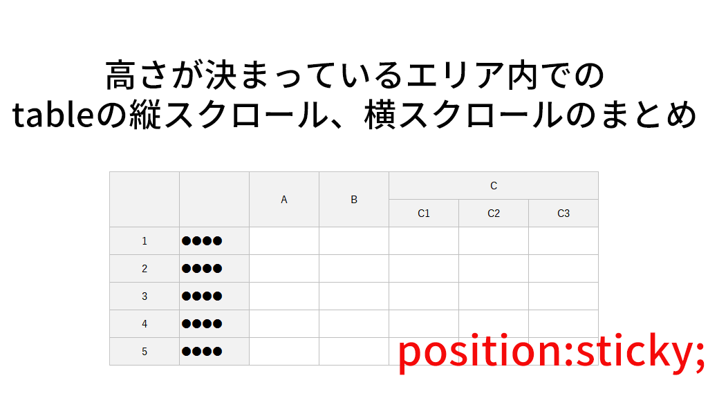
その辺も含めて、tableの縦スクロール、横スクロール、縦横スクロールをまとめたいと思う。
ここでは、まず「高さが決まっているエリア内」でtableのスクロールを紹介する。
応用編として、ウィンドウサイズに追従するエリア内でのtableのスクロールについては、下記の記事で紹介する。
https://yypark.com/anything-nothing/css/67
主に、ブラウザベースのシステムの画面に活用できると思う。
タイトル行1行を固定して縦スクロール
まずは基本形から。高さが決まっているエリア(div)の中にtableを配置し、1行目をタイトル行として固定し、残りの行を縦スクロールさせるケース。
tableの行の固定は、定番の position:sticky; を使う。タイトル行は <thead> で囲ってあるので、theadに対して position:sticky; を指定する。
通常tableを使用する際、border-collapse:collapse; を使っているが、position:sticky; の場合、tableの上部に隙間ができてしまったり、スクロールした際、枠線(border)が消えてしまったりと、何かと不都合が多い。
これらを解決するために、疑似要素を使う情報が多いが、俺は、collapse は使わずに border-collapse:separate; を使う。その場合、隣接するセルでborderが重なると太さが倍になってしまうので、そこは丁寧に指定していく。
デモはこちら。
https://yypark.com/anything-nothing/demo/66/vercital-scroll-fixed-1row.php
HTMLコードとSCSSの指定は下記のとおり。
どの部分の指定なのか?わかりやすいように枠線や背景色を付けている。
<body>
<h1>高さが決まっているエリアで、タイトル行1行を固定して縦スクロール</h1>

<div class="scrolltable">
<table>
<thead>
<tr>
<th>ID</th>
<th>名前</th>
<th>住所</th>
<th>携帯電話</th>
<th>項目1</th>
<th>項目2</th>
<th>項目3</th>
<th>項目4</th>
<th>項目5</th>
</tr>
</thead>
<tbody>
<tr>
<td>1</td>
<td>田中太郎1</td>
<td>東京都千代田区1丁目1-1</td>
<td>090-0000-0001</td>
<td>項目-0001-01</td>
<td>項目-0001-02</td>
<td>項目-0001-03</td>
<td>項目-0001-04</td>
<td>項目-0001-05</td>
</tr>
・・・
</tbody>
</table>
</div>

</body>
body {
margin:10px;
}
.scrolltable {
border:1px solid #333333;
//スクロールさせるエリアは高さ400pxとする。overflow-y:auto;で必要に応じてスクロールバー
height:400px;
overflow-y:auto;
table {
border-collapse:separate;
border-spacing:0;
empty-cells:show;
th,td {
padding:0.5rem;
}
//隣接するborderが重ならないように
th,td {
border-right:1px solid #008800;
border-bottom:1px solid #008800;
&:first-of-type {
border-left:1px solid #008800;
}
}
thead th {
border-top:1px solid #008800;
}
//タイトル行1行固定
thead {
position:sticky;
top:0;
background:#99ccff; //青
}
}
}タイトル行2行を固定して縦スクロール
タイトル行が2行になるケース。
HTMLでtheadの中を2行にするだけ。SCSSの指定は、2行になったタイトル行に枠線(border)の指定が若干変わるだけで、タイトル行を固定するやり方は1行の時と同じ。
デモはこちら。
https://yypark.com/anything-nothing/demo/66/vercital-scroll-fixed-2row.php
HTMLコードとSCSSの指定は下記のとおり。
<body>
<h1>高さが決まっているエリア内で、タイトル行2行を固定して縦スクロール</h1>

<div class="scrolltable">
<table>
<thead>
<tr>
<th rowspan="2">ID</th>
<th rowspan="2">名前</th>
<th rowspan="2">住所</th>
<th rowspan="2">携帯電話</th>
<th colspan="5">項目</th>
</tr>
<tr>
<th>1</th>
<th>2</th>
<th>3</th>
<th>4</th>
<th>5</th>
</tr>
</thead>
<tbody>
<tr>
<td>1</td>
<td>田中太郎1</td>
<td>盛岡市大手1丁目1-1</td>
<td>090-0000-0001</td>
<td>項目-0001-01</td>
<td>項目-0001-02</td>
<td>項目-0001-03</td>
<td>項目-0001-04</td>
<td>項目-0001-05</td>
</tr>
・・・
</tbody>
</table>
</div>

</body>
body {
margin:10px;
}
.scrolltable {
border:1px solid #333333;
//スクロールさせるエリアは高さ400pxとする。overflow-y:auto;で必要に応じてスクロールバー
height:400px;
overflow-y:auto;
table {
border-collapse:separate;
border-spacing:0;
empty-cells:show;
th,td {
padding:0.5rem;
}
//隣接するborderが重ならないように
th,td {
border-right:1px solid #008800;
border-bottom:1px solid #008800;
&:first-of-type {
border-left:1px solid #008800;
}
}
thead tr:first-of-type th {
border-top:1px solid #008800;
}
thead tr:last-of-type th {
border-left:none;
}
//タイトル行2行固定
thead {
position:sticky;
top:0;
background:#99ccff; //青
}
}
}左1列を固定して横スクロール
左1列を固定して横スクロールさせるケース。スマホなどで、横長のtableを表示させる際は、このケースになる。
横スクロールなので、左1列目の指定は、position:sticky; left:0; となる。また、横スクロールの場合は、tableに幅の指定が必要になる。
デモはこちら。
https://yypark.com/anything-nothing/demo/66/horizontal-scroll-fixed-1col.php
HTMLコードとSCSSの指定は下記のとおり。
<body>
<h1>高さが決まっているエリア内で、左1列を固定して横スクロール</h1>

<div class="scrolltable">
<table>
<thead>
<tr>
<th>ID</th>
<th>名前</th>
<th>住所</th>
<th>携帯電話</th>
<th>項目1</th>
<th>項目2</th>
<th>項目3</th>
<th>項目4</th>
<th>項目5</th>
<th>項目6</th>
<th>項目7</th>
<th>項目8</th>
<th>項目9</th>
<th>項目10</th>
</tr>
</thead>
<tbody>
<tr>
<td>1</td>
<td>田中太郎1</td>
<td>盛岡市大手1丁目1-1</td>
<td>090-0000-0001</td>
<td>項目-0001-01</td>
<td>項目-0001-02</td>
<td>項目-0001-03</td>
<td>項目-0001-04</td>
<td>項目-0001-05</td>
<td>項目-0001-06</td>
<td>項目-0001-07</td>
<td>項目-0001-08</td>
<td>項目-0001-09</td>
<td>項目-0001-10</td>
</tr>
・・・
</tbody>
</table>
</div>

</body>
body {
margin:10px;
}
.scrolltable {
border:1px solid #333333;
//スクロールさせるエリアは高さ400pxとする。overflow-x:auto;で必要に応じてスクロールバー
height:400px;
overflow-x:auto;
table {
border-collapse:separate;
border-spacing:0;
empty-cells:show;
//横スクロールの場合はtableの幅を指定する
width:1450px;
th,td {
padding:0.5rem;
}
//隣接するborderが重ならないように
th,td {
border-right:1px solid #008800;
border-bottom:1px solid #008800;
&:first-of-type {
border-left:1px solid #008800;
}
}
thead th {
border-top:1px solid #008800;
}
//左1列固定
th:first-of-type,
td:first-of-type {
position:sticky;
left:0;
background:#ffcc99; //ベージュ
}
}
}左2列を固定して横スクロール
左2列を固定して横スクロールさせるケース。例えば、デモにもあるように、IDと名前を固定したい場合はこのケースになる。
左2列を固定する場合、左1列目と左2列目に対して、position:sticky; を指定する。
左1列目は left:;0; で良いが、左2列目は、左1列目の幅と同じ値を left に指定することになる。つまり、左1列目は、widthで幅を指定しなければならない。
また、tableの幅は、本来の幅に左1列目分の幅を加算する。
デモはこちら。
https://yypark.com/anything-nothing/demo/66/horizontal-scroll-fixed-2col.php
HTMLコードとSCSSの指定は下記のとおり。
<body>
<h1>高さが決まっているエリア内で、左2列を固定して横スクロール</h1>

<div class="scrolltable">
<table>
<thead>
<tr>
<th>ID</th>
<th>名前</th>
<th>住所</th>
<th>携帯電話</th>
<th>項目1</th>
<th>項目2</th>
<th>項目3</th>
<th>項目4</th>
<th>項目5</th>
<th>項目6</th>
<th>項目7</th>
<th>項目8</th>
<th>項目9</th>
<th>項目10</th>
</tr>
</thead>
<tbody>
<tr>
<td>1</td>
<td>田中太郎1</td>
<td>福井市大手1丁目1-1</td>
<td>090-0000-0001</td>
<td>項目-0001-01</td>
<td>項目-0001-02</td>
<td>項目-0001-03</td>
<td>項目-0001-04</td>
<td>項目-0001-05</td>
<td>項目-0001-06</td>
<td>項目-0001-07</td>
<td>項目-0001-08</td>
<td>項目-0001-09</td>
<td>項目-0001-10</td>
</tr>
・・・
</tbody>
</table>
</div>

</body>
body {
margin:10px;
}
.scrolltable {
border:1px solid #333333;
//スクロールさせるエリアは高さ400pxとする。overflow-x:auto;で必要に応じてスクロールバー
height:400px;
overflow-x:auto;
table {
border-collapse:separate;
border-spacing:0;
empty-cells:show;
//横スクロールの場合はtableの幅を指定する(左1列目の幅を加算)
width:calc(1450px + 40px);
th,td {
padding:0.5rem;
}
//隣接するborderが重ならないように
th,td {
border-right:1px solid #008800;
border-bottom:1px solid #008800;
&:first-of-type {
border-left:1px solid #008800;
}
}
thead th {
border-top:1px solid #008800;
}
//左1列固定
th:first-of-type,
td:first-of-type {
position:sticky;
left:0;
width:40px; //1列目の幅を指定
background:#ffcc99; //ベージュ
}
//左2列目固定
th:nth-of-type(2),
td:nth-of-type(2) {
position:sticky;
left:40px; //1列目の幅と同じだけ
background:#ffff99; //黄色
}
}
}タイトル行1行と左1列を固定して縦横スクロール
縦スクロールと横スクロールの合わせ技。EXCELの「ウィンドウ固定」のようなイメージ。
単純に、タイトル行1行固定と左1列固定の両方を指定すればOKのように思えるが、それだけだと、タイトル行の左1列目(デモのIDのピンク色の部分)が、横スクロールの際は、横に流れてしまい、縦スクロールの際は、その下の行の左1列目のスクロールの下に隠れてしまう。
縦横スクロールの際は、縦横スクロールしても動かない部分は、position:sticky; top:0; left:0; で動かないようにし、z-index:10; で下からのスクロールの下に隠れないように指定する必要がある。
デモはこちら。
https://yypark.com/anything-nothing/demo/66/vercital-horizontal-scroll-fixed-1row1col.php
HTMLコードとSCSSの指定は下記のとおり。
<body>
<h1>高さが決まっているエリア内で、タイトル行1行と左1列を固定して縦横スクロール</h1>

<div class="scrolltable">
<table>
<thead>
<tr>
<th>ID</th>
<th>名前</th>
<th>住所</th>
<th>携帯電話</th>
<th>項目1</th>
<th>項目2</th>
<th>項目3</th>
<th>項目4</th>
<th>項目5</th>
<th>項目6</th>
<th>項目7</th>
<th>項目8</th>
<th>項目9</th>
<th>項目10</th>
</tr>
</thead>
<tbody>
<tr>
<td>1</td>
<td>田中太郎1</td>
<td>盛岡市大手1丁目1-1</td>
<td>090-0000-0001</td>
<td>項目-0001-01</td>
<td>項目-0001-02</td>
<td>項目-0001-03</td>
<td>項目-0001-04</td>
<td>項目-0001-05</td>
<td>項目-0001-06</td>
<td>項目-0001-07</td>
<td>項目-0001-08</td>
<td>項目-0001-09</td>
<td>項目-0001-10</td>
</tr>
・・・
</tbody>
</table>
</div>

</body>
body {
margin:10px;
}
.scrolltable {
border:1px solid #333333;
//スクロールさせるエリアは高さ400pxとする。overflow-x:auto;overflow-y:auto;で必要に応じてスクロールバー
height:400px;
overflow-x:auto;
overflow-y:auto;
table {
border-collapse:separate;
border-spacing:0;
empty-cells:show;
//横スクロールの場合はtableの幅を指定する
width:1450px;
th,td {
padding:0.5rem;
}
//隣接するborderが重ならないように
th,td {
border-right:1px solid #008800;
border-bottom:1px solid #008800;
padding:0.5rem;
&:first-of-type {
border-left:1px solid #008800;
}
}
thead th {
border-top:1px solid #008800;
}
//タイトル行1行固定
//タイトル行の左1列目(縦横スクロールしても動かない部分)
thead th:first-of-type {
position:sticky;
top:0;
left:0;
z-index:10; //縦横スクロールしても隠れないように
background:#ff99cc; //ピンク
}
//タイトル行の左1列目以外
thead th:not(:first-of-type) {
position:sticky;
top:0;
background:#99ccff; //青
}
//左1列固定(タイトル行以外)
td:first-of-type {
position:sticky;
left:0;
background:#ffcc99; //ベージュ
}
}
}タイトル行2行と左2列を固定して縦横スクロール
タイトル行1行左1列固定の拡張版。
ポイントは、動かないセルが複数あること(デモのピンクとゴールドの部分)。それ故に、タイトル行2行固定の縦スクロールでは、タイトル行が何行あったとしても thead で固定できたが、縦横スクロールの場合は、動かない部分は別指定になるため、thead で固定できない。つまり、各行の左側の動かない部分とそれ以外の部分で指定する必要がある。
左2列の横スクロールの際、2列目のleft の値は1列目のwidthと同じ値を指定すると書いたが、これと同じで、タイトル行2行目の top の値は、タイトル行1行目の高さを同じにしないといけない。
また、左2列固定なので、tableの幅にも注意する。
デモはこちら。
https://yypark.com/anything-nothing/demo/66/vercital-horizontal-scroll-fixed-2row2col.php
HTMLコードとSCSSの指定は下記のとおり。
<body>
<h1>高さが決まっているエリア内で、タイトル行2行と左2列を固定して縦横スクロール</h1>

<div class="scrolltable">
<table>
<thead>
<tr>
<th rowspan="2">ID</th>
<th rowspan="2">名前</th>
<th rowspan="2">住所</th>
<th rowspan="2">携帯電話</th>
<th colspan="10">項目</th>
</tr>
<tr>
<th>1</th>
<th>2</th>
<th>3</th>
<th>4</th>
<th>5</th>
<th>6</th>
<th>7</th>
<th>8</th>
<th>9</th>
<th>10</th>
</tr>
</thead>
<tbody>
<tr>
<td>1</td>
<td>田中太郎1</td>
<td>盛岡市大手1丁目1-1</td>
<td>090-0000-0001</td>
<td>項目-0001-01</td>
<td>項目-0001-02</td>
<td>項目-0001-03</td>
<td>項目-0001-04</td>
<td>項目-0001-05</td>
<td>項目-0001-06</td>
<td>項目-0001-07</td>
<td>項目-0001-08</td>
<td>項目-0001-09</td>
<td>項目-0001-10</td>
</tr>
・・・
</tbody>
</table>
</div>

</body>
body {
margin:10px;
}
.scrolltable {
border:1px solid #333333;
//スクロールさせるエリアは高さ400pxとする。overflow-x:auto;overflow-y:auto;で必要に応じてスクロールバー
height:400px;
overflow-x:auto;
overflow-y:auto;
table {
border-collapse:separate;
border-spacing:0;
empty-cells:show;
//横スクロールの場合はtableの幅を指定する(左1列目の幅を加算)
width:calc(1450px + 40px);
th,td {
padding:0.5rem;
}
//隣接するborderが重ならないように
th,td {
border-right:1px solid #008800;
border-bottom:1px solid #008800;
&:first-of-type {
border-left:1px solid #008800;
}
}
thead tr:first-of-type th {
border-top:1px solid #008800;
}
thead tr:last-of-type th {
border-left:none;
}
//タイトル行1行目固定
//タイトル行1行目の左1列目(縦横スクロールしても動かない部分)
thead tr:first-of-type th:first-of-type {
position:sticky;
top:0;
left:0;
z-index:10; //縦横スクロールしても隠れないように
background:#ff99cc; //ピンク
}
//タイトル行1行目の左2列目(縦横スクロールしても動かない部分)
thead tr:first-of-type th:nth-of-type(2) {
position:sticky;
top:0;
left:40px;
z-index:10; //縦横スクロールしても隠れないように
background:#ffcc00; //ゴールド
}
//タイトル行1行目の左1列目2列目以外
thead tr:first-of-type th:not(:first-of-type,:nth-of-type(2)) {
position:sticky;
top:0;
background:#99ccff; //青
}
//タイトル行2行目
thead tr:not(:first-of-type) th {
position:sticky;
top:36px; //1行目の高さ
background:#ccffff; //水色
}
//左1列固定(タイトル行以外)
td:first-of-type {
position:sticky;
left:0;
width:40px; //1列目の幅を指定
background:#ffcc99; //ベージュ
}
//左2列目固定(タイトル行以外)
td:nth-of-type(2) {
position:sticky;
left:40px; //1列目の幅と同じだけ
background:#ffff99; //黄色
}
}
}参考サイト
下記のサイトを参考にさせていただいた。Thank you very much!!
- 縦横スクロール CSSでtableをレスポンシブにする方法
https://tokushiyo.net/web/responsive-table-layout/ - CSSでテーブル表の一部を固定してスクロールする方法 | 福岡のホームページ制作会社 | シンス株式会社
https://since-inc.jp/blog/8675 - 【CSS】レスポンシブ対応縦横ヘッダ固定テーブル(縦横スクロール) | 株式会社レクタス
https://www.rectus.co.jp/archives/2371