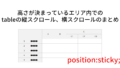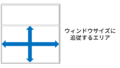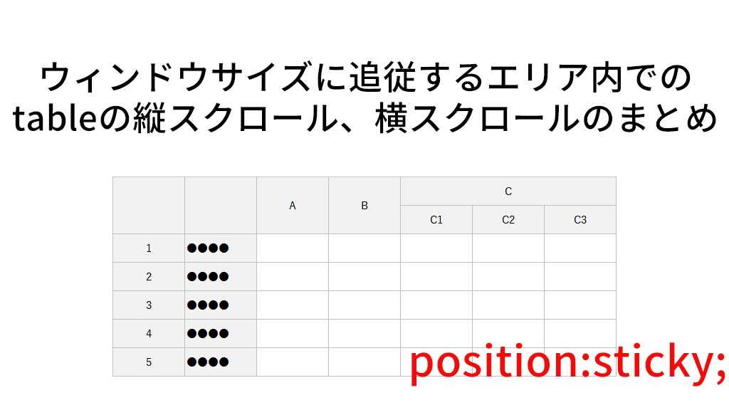
「tableの縦スクロール、横スクロールのまとめ」では「高さが決まっているエリア内」でのtableのスクロールをまとめた。ここでは、その応用編として、ウィンドウサイズに追従するエリア内でのtableの縦スクロール、横スクロール、縦横スクロールをまとめたいと思う。
どちらかと言えば、ブラウザベースのシステムの画面向けで、EXCELの「ウィンドウ固定」のようなUIとなる。
「ウィンドウサイズに追従するエリア」の作り方は、下記のページを参照して欲しい。
https://yypark.com/anything-nothing/css/69
「高さが決まっているエリア内」との相違
高さが決まっているエリア内の場合、単純に height:400px; として高さを決めていた。
ウィンドウサイズに追従させる際は、body直下にdivを1枚入れ、それにdisplay:flex;flex-direction:column;height:100vh; を指定し、高さを100vh(ブラウザの表示エリアの高さ全部)を指定し、中の要素自体は縦並びにする。ウィンドウサイズに追従させたい要素(このデモの場合 .scrolltable)に、flex:1; を指定する。
table自体のCSSの指定は、高さが決まっているエリア内のケースと同じとなる。
下記、高さが決まっているエリア内と同じケースを紹介するが、相違点は上記のとおりになるので、table自体のCSSの説明は、高さが決まっているエリア内の記事を参照して欲しい。
タイトル行1行を固定して縦スクロール
デモはこちら。
https://yypark.com/anything-nothing/demo/67/vercital-scroll-fixed-1row.php
HTMLコードとSCSSの指定は下記のとおり。
<body>
<div class="body">
<h1>ウィンドウサイズに追従するエリア内で、タイトル行1行を固定して縦スクロール</h1>

<div class="scrolltable">
<table>
<thead>
<tr>
<th>ID</th>
<th>名前</th>
<th>住所</th>
<th>携帯電話</th>
<th>項目1</th>
<th>項目2</th>
<th>項目3</th>
<th>項目4</th>
<th>項目5</th>
</tr>
</thead>
<tbody>
<tr>
<td>1</td>
<td>田中太郎1</td>
<td>盛岡市大手1丁目1-1</td>
<td>090-0000-0001</td>
<td>項目-0001-01</td>
<td>項目-0001-02</td>
<td>項目-0001-03</td>
<td>項目-0001-04</td>
<td>項目-0001-05</td>
</tr>
・・・
</tbody>
</table>
</div>

</div>
</body>
body {
margin:10px;
}
.body {
//body 直下の要素にこれを指定
display:flex;
flex-direction:column;
width:100%;
height:calc(100vh - 20px); //bodyのmargin分だけ差し引く
}
.scrolltable {
border:1px solid #333333;
//指定エリアはウィンドウサイズに追従。overflow-y:auto;で必要な時にスクロールバー
flex:1;
overflow-y:auto;
table {
border-collapse:separate;
border-spacing:0;
empty-cells:show;
th,td {
padding:0.5rem;
}
//隣接するborderが重ならないように
th,td {
border-right:1px solid #008800;
border-bottom:1px solid #008800;
&:first-of-type {
border-left:1px solid #008800;
}
}
thead th {
border-top:1px solid #008800;
}
//タイトル行1行固定
thead {
position:sticky;
top:0;
background:#99ccff; //青
}
}
}タイトル行2行を固定して縦スクロール
デモはこちら。
https://yypark.com/anything-nothing/demo/67/vercital-scroll-fixed-2row.php
HTMLコードとSCSSの指定は下記のとおり。
<body>
<div class="body">
<h1>ウィンドウサイズに追従するエリア内で、タイトル行2行を固定して縦スクロール</h1>

<div class="scrolltable">
<table>
<thead>
<tr>
<th rowspan="2">ID</th>
<th rowspan="2">名前</th>
<th rowspan="2">住所</th>
<th rowspan="2">携帯電話</th>
<th colspan="5">項目</th>
</tr>
<tr>
<th>1</th>
<th>2</th>
<th>3</th>
<th>4</th>
<th>5</th>
</tr>
</thead>
<tbody>
<tr>
<td>1</td>
<td>田中太郎1</td>
<td>盛岡市大手1丁目1-1</td>
<td>090-0000-0001</td>
<td>項目-0001-01</td>
<td>項目-0001-02</td>
<td>項目-0001-03</td>
<td>項目-0001-04</td>
<td>項目-0001-05</td>
</tr>
・・・
</tbody>
</table>
</div>

</div>
</body>
body {
margin:10px;
}
.body {
//body 直下の要素にこれを指定
display:flex;
flex-direction:column;
width:100%;
height:calc(100vh - 20px); //bodyのmargin分だけ差し引く
}
.scrolltable {
border:1px solid #333333;
//指定エリアはウィンドウサイズに追従。overflow-y:auto;で必要な時にスクロールバー
flex:1;
overflow-y:auto;
table {
border-collapse:separate;
border-spacing:0;
empty-cells:show;
th,td {
padding:0.5rem;
}
//隣接するborderが重ならないように
th,td {
border-right:1px solid #008800;
border-bottom:1px solid #008800;
&:first-of-type {
border-left:1px solid #008800;
}
}
thead th {
border-top:1px solid #008800;
}
//タイトル行1行固定
thead {
position:sticky;
top:0;
background:#99ccff; //青
}
}
}左1列を固定して横スクロール
デモはこちら。
https://yypark.com/anything-nothing/demo/67/horizontal-scroll-fixed-1col.php
HTMLコードとSCSSの指定は下記のとおり。
<body>
<div class="body">
<h1>ウィンドウサイズに追従するエリア内で、左1列を固定して横スクロール</h1>

<div class="scrolltable">
<table>
<thead>
<tr>
<th>ID</th>
<th>名前</th>
<th>住所</th>
<th>携帯電話</th>
<th>項目1</th>
<th>項目2</th>
<th>項目3</th>
<th>項目4</th>
<th>項目5</th>
<th>項目6</th>
<th>項目7</th>
<th>項目8</th>
<th>項目9</th>
<th>項目10</th>
</tr>
</thead>
<tbody>
<tr>
<td>1</td>
<td>田中太郎1</td>
<td>盛岡市大手1丁目1-1</td>
<td>090-0000-0001</td>
<td>項目-0001-01</td>
<td>項目-0001-02</td>
<td>項目-0001-03</td>
<td>項目-0001-04</td>
<td>項目-0001-05</td>
<td>項目-0001-06</td>
<td>項目-0001-07</td>
<td>項目-0001-08</td>
<td>項目-0001-09</td>
<td>項目-0001-10</td>
</tr>
・・・
</tbody>
</table>
</div>

</div>
</body>
body {
margin:10px;
}
.body {
//body 直下の要素にこれを指定
display:flex;
flex-direction:column;
width:100%;
height:calc(100vh - 20px); //bodyのmargin分だけ差し引く
}
.scrolltable {
border:1px solid #333333;
//指定エリアはウィンドウサイズに追従。overflow-x:auto;で必要な時にスクロールバー
flex:1;
overflow-x:auto;
table {
border-collapse:separate;
border-spacing:0;
empty-cells:show;
//横スクロールの場合はtableの幅を指定する
width:1450px;
th,td {
padding:0.5rem;
}
//隣接するborderが重ならないように
th,td {
border-right:1px solid #008800;
border-bottom:1px solid #008800;
&:first-of-type {
border-left:1px solid #008800;
}
}
thead th {
border-top:1px solid #008800;
}
//左1列固定
th:first-of-type,
td:first-of-type {
position:sticky;
left:0;
background:#ffcc99; //ベージュ
}
}
}左2列を固定して横スクロール
デモはこちら。
https://yypark.com/anything-nothing/demo/67/horizontal-scroll-fixed-2col.php
HTMLコードとSCSSの指定は下記のとおり。
<body>
<div class="body">
<h1>ウィンドウサイズに追従するエリア内で、左2列を固定して横スクロール</h1>

<div class="scrolltable">
<table>
<thead>
<tr>
<th>ID</th>
<th>名前</th>
<th>住所</th>
<th>携帯電話</th>
<th>項目1</th>
<th>項目2</th>
<th>項目3</th>
<th>項目4</th>
<th>項目5</th>
<th>項目6</th>
<th>項目7</th>
<th>項目8</th>
<th>項目9</th>
<th>項目10</th>
</tr>
</thead>
<tbody>
<tr>
<td>1</td>
<td>田中太郎1</td>
<td>盛岡市大手1丁目1-1</td>
<td>090-0000-0001</td>
<td>項目-0001-01</td>
<td>項目-0001-02</td>
<td>項目-0001-03</td>
<td>項目-0001-04</td>
<td>項目-0001-05</td>
<td>項目-0001-06</td>
<td>項目-0001-07</td>
<td>項目-0001-08</td>
<td>項目-0001-09</td>
<td>項目-0001-10</td>
</tr>
・・・
</tbody>
</table>
</div>

</div>
</body>
body {
margin:10px;
}
.body {
//body 直下の要素にこれを指定
display:flex;
flex-direction:column;
width:100%;
height:calc(100vh - 20px); //bodyのmargin分だけ差し引く
}
.scrolltable {
border:1px solid #333333;
//指定エリアはウィンドウサイズに追従。overflow-x:auto;で必要な時にスクロールバー
flex:1;
overflow-x:auto;
table {
border-collapse:separate;
border-spacing:0;
empty-cells:show;
//横スクロールの場合はtableの幅を指定する(左1列目の幅を加算)
width:calc(1450px + 40px);
th,td {
padding:0.5rem;
}
//隣接するborderが重ならないように
th,td {
border-right:1px solid #008800;
border-bottom:1px solid #008800;
&:first-of-type {
border-left:1px solid #008800;
}
}
thead th {
border-top:1px solid #008800;
}
//左1列固定
th:first-of-type,
td:first-of-type {
position:sticky;
left:0;
width:40px; //1列目の幅を指定
background:#ffcc99; //ベージュ
}
//左2列目固定
th:nth-of-type(2),
td:nth-of-type(2) {
position:sticky;
left:40px; //1列目の幅と同じだけ
background:#ffff99; //黄色
}
}
}タイトル行1行と左1列を固定して縦横スクロール
デモはこちら。
https://yypark.com/anything-nothing/demo/67/vercital-horizontal-scroll-fixed-1row1col.php
HTMLコードとSCSSの指定は下記のとおり。
<body>
<div class="body">
<h1>ウィンドウサイズに追従するエリア内で、タイトル行1行と左1列を固定して縦横スクロール</h1>

<div class="scrolltable">
<table>
<thead>
<tr>
<th>ID</th>
<th>名前</th>
<th>住所</th>
<th>携帯電話</th>
<th>項目1</th>
<th>項目2</th>
<th>項目3</th>
<th>項目4</th>
<th>項目5</th>
<th>項目6</th>
<th>項目7</th>
<th>項目8</th>
<th>項目9</th>
<th>項目10</th>
</tr>
</thead>
<tbody>
<tr>
<td>1</td>
<td>田中太郎1</td>
<td>盛岡市大手1丁目1-1</td>
<td>090-0000-0001</td>
<td>項目-0001-01</td>
<td>項目-0001-02</td>
<td>項目-0001-03</td>
<td>項目-0001-04</td>
<td>項目-0001-05</td>
<td>項目-0001-06</td>
<td>項目-0001-07</td>
<td>項目-0001-08</td>
<td>項目-0001-09</td>
<td>項目-0001-10</td>
</tr>
・・・
</tbody>
</table>
</div>

</div>
</body>
body {
margin:10px;
}
.body {
//body 直下の要素にこれを指定
display:flex;
flex-direction:column;
width:100%;
height:calc(100vh - 20px); //bodyのmargin分だけ差し引く
}
.scrolltable {
border:1px solid #333333;
//指定エリアはウィンドウサイズに追従。overflow-x:auto;overflow-y:auto;で必要に応じてスクロールバー
flex:1;
overflow-x:auto;
overflow-y:auto;
table {
border-collapse:separate;
border-spacing:0;
empty-cells:show;
//横スクロールの場合はtableの幅を指定する
width:1450px;
th,td {
padding:0.5rem;
}
//隣接するborderが重ならないように
th,td {
border-right:1px solid #008800;
border-bottom:1px solid #008800;
padding:0.5rem;
&:first-of-type {
border-left:1px solid #008800;
}
}
thead th {
border-top:1px solid #008800;
}
//タイトル行1行固定
//タイトル行の左1列目(縦横スクロールしても動かない部分)
thead th:first-of-type {
position:sticky;
top:0;
left:0;
z-index:10; //縦横スクロールしても隠れないように
background:#ff99cc; //ピンク
}
//タイトル行の左1列目以外
thead th:not(:first-of-type) {
position:sticky;
top:0;
background:#99ccff; //青
}
//左1列固定(タイトル行以外)
td:first-of-type {
position:sticky;
left:0;
background:#ffcc99; //ベージュ
}
}
}タイトル行2行と左2列を固定して縦横スクロール
デモはこちら。
https://yypark.com/anything-nothing/demo/67/vercital-horizontal-scroll-fixed-2row2col.php
HTMLコードとSCSSの指定は下記のとおり。
<body>
<div class="body">
<h1>ウィンドウサイズに追従するエリア内で、タイトル行2行と左2列を固定して縦横スクロール</h1>

<div class="scrolltable">
<table>
<thead>
<tr>
<th rowspan="2">ID</th>
<th rowspan="2">名前</th>
<th rowspan="2">住所</th>
<th rowspan="2">携帯電話</th>
<th colspan="10">項目</th>
</tr>
<tr>
<th>1</th>
<th>2</th>
<th>3</th>
<th>4</th>
<th>5</th>
<th>6</th>
<th>7</th>
<th>8</th>
<th>9</th>
<th>10</th>
</tr>
</thead>
<tbody>
<tr>
<td>1</td>
<td>田中太郎1</td>
<td>盛岡市大手1丁目1-1</td>
<td>090-0000-0001</td>
<td>項目-0001-01</td>
<td>項目-0001-02</td>
<td>項目-0001-03</td>
<td>項目-0001-04</td>
<td>項目-0001-05</td>
<td>項目-0001-06</td>
<td>項目-0001-07</td>
<td>項目-0001-08</td>
<td>項目-0001-09</td>
<td>項目-0001-10</td>
</tr>
・・・
</tbody>
</table>
</div>

</div>
</body>
body {
margin:10px;
}
.body {
//body 直下の要素にこれを指定
display:flex;
flex-direction:column;
width:100%;
height:calc(100vh - 20px); //bodyのmargin分だけ差し引く
}
.scrolltable {
border:1px solid #333333;
//指定エリアはウィンドウサイズに追従。overflow-x:auto;overflow-y:auto;で必要に応じてスクロールバー
flex:1;
overflow-x:auto;
overflow-y:auto;
table {
border-collapse:separate;
border-spacing:0;
empty-cells:show;
//横スクロールの場合はtableの幅を指定する(左1列目の幅を加算)
width:calc(1450px + 40px);
th,td {
padding:0.5rem;
}
//隣接するborderが重ならないように
th,td {
border-right:1px solid #008800;
border-bottom:1px solid #008800;
&:first-of-type {
border-left:1px solid #008800;
}
}
thead tr:first-of-type th {
border-top:1px solid #008800;
}
thead tr:last-of-type th {
border-left:none;
}
//タイトル行1行目固定
//タイトル行1行目の左1列目(縦横スクロールしても動かない部分)
thead tr:first-of-type th:first-of-type {
position:sticky;
top:0;
left:0;
z-index:10; //縦横スクロールしても隠れないように
background:#ff99cc; //ピンク
}
//タイトル行1行目の左2列目(縦横スクロールしても動かない部分)
thead tr:first-of-type th:nth-of-type(2) {
position:sticky;
top:0;
left:40px;
z-index:10; //縦横スクロールしても隠れないように
background:#ffcc00; //ゴールド
}
//タイトル行1行目の左1列目2列目以外
thead tr:first-of-type th:not(:first-of-type,:nth-of-type(2)) {
position:sticky;
top:0;
background:#99ccff; //青
}
//タイトル行2行目
thead tr:not(:first-of-type) th {
position:sticky;
top:36px; //1行目の高さ
background:#ccffff; //水色
}
//左1列固定(タイトル行以外)
td:first-of-type {
position:sticky;
left:0;
width:40px; //1列目の幅を指定
background:#ffcc99; //ベージュ
}
//左2列目固定(タイトル行以外)
td:nth-of-type(2) {
position:sticky;
left:40px; //1列目の幅と同じだけ
background:#ffff99; //黄色
}
}
}参考サイト
下記のサイトを参考にさせていただいた。Thank you very much!!
- 縦横スクロール CSSでtableをレスポンシブにする方法
https://tokushiyo.net/web/responsive-table-layout/ - CSSでテーブル表の一部を固定してスクロールする方法 | 福岡のホームページ制作会社 | シンス株式会社
https://since-inc.jp/blog/8675 - 【CSS】レスポンシブ対応縦横ヘッダ固定テーブル(縦横スクロール) | 株式会社レクタス
https://www.rectus.co.jp/archives/2371